Tuesday, August 4, 2009

Star plots


Star plots allow you to compare different types of data for various experiments or designs. The radius of the star or design represents different characteristics. This particular star plot is a plot of MER IDD and other various designs.

source: https://blogger.googleusercontent.com/img/b/R29vZ2xl/AVvXsEjWz-5thcbtTlVmyaVIg80rlNj11FEbdsPaT5v7oD6RjXlGeGqJxbxTroN8P1D6rtHTJRN3Nwq1kNTi73-3xVgPiidbycUk-NCrooxTC996ciJOmBGJDmhyphenhyphenGz_HUFxoxojg88xRxTA1nsYC/s400/starplot.gif
Correlation matrix


In statistics, correlation (often measured as a correlation coefficient, ρ) indicates the strength and direction of a linear relationship between two random variables.

source: http://www.mega.nu/ampp/rummel/uc.tab8.1.gif

Similarity matrix


A similarity matrix is a matrix of scores which express the similarity between two data points. Similarity matrices are strongly related to their counterparts, distance matrices and substitution matrices.

source: http://tomcat.esat.kuleuven.be/txtgate/images/distmat.png

Stem and leaf plot


Stem-and-leaf plots are a method for showing the frequency with which certain classes of values occur. You could make a frequency distribution table or a histogram for the values, or you can use a stem-and-leaf plot and let the numbers themselves to show pretty much the same information.

source: http://www.learner.org/courses/learningmath/data/images/session3/3d3_solution.gif

Box plot


A box plot or boxplot (also known as a box-and-whisker diagram or plot) is a convenient way of graphically depicting groups of numerical data through their five-number summaries (the smallest observation (sample minimum), lower quartile (Q1), median (Q2), upper quartile (Q3), and largest observation (sample maximum). A boxplot may also indicate which observations, if any, might be considered outliers.

source: http://www.itl.nist.gov/div898/handbook/eda/gif/boxplot0.gif

Histogram


A histogram is a graphical display of tabulated frequencies, shown as bars. It shows what proportion of cases fall into each of several categories: it is a form of data binning. The categories are usually specified as non-overlapping intervals of some variable. The categories (bars) must be adjacent. The intervals (or bands, or bins) are generally of the same size.

source: http://www.daisy2000.com/Daisy2003/HorizontalHistogram.gif

Parallel coordinate graph


A parallel coordinate graph is used to plot large multivariate sets of data. One line in a parallel coordinate graph connects a series of variable of different values such as in the one depicted.

source: http://www.stat.columbia.edu/~cook/movabletype/mlm/mdg1.png

Triangular Plot


A triangle plot is a barycentric plot on three variables which sum to a constant. It graphically depicts the ratios of the three variables as positions in an equilateral triangle

source: http://www.ex-parrot.com/~chris/images/20050407/triangle.png

Windrose


A wind rose is a graphic tool used by
meteorologists to give a succinct view of how wind speed and direction are typically distributed at a particular location. Historically, wind roses were predecessors of the compass rose on maps, as there was no differentiation between a cardinal direction and the wind which blew from such a direction.

source: http://upload.wikimedia.org/wikipedia/commons/7/70/Wind_rose_plot.jpg

Climograph


A climograph is a graphical depiction of the monthly precipitation and temperature conditions for a selected place. Precipitation is shown by the bar graph. A line graph depicts temperature.

source: http://wps.prenhall.com/wps/media/objects/214/219557/climograph2_national_drought%20_mitigation_center.gif

Population profile


A population profile graph helps show the population of a given area in order to determine any number of things concerning population.

source: http://www.populationaction.org/Publications/Reports/The_Shape_of_Things_to_Come/asset_upload_file420_6098.gif

Scatterplot


A scatter plot is a type of display using Cartesian coordinates to display values for two variables for a set of data. The data is displayed as a collection of points, each having the value of one variable determining the position on the horizontal axis and the value of the other variable determining the position on the vertical axis.

source: http://cnx.org/content/m10949/latest/age_scatterplot.gif

Index Value Plot


This index value plot helps display current streamflow with historical streamflow for the United States. The index value plot will help show discrepencies between data information.

source: http://waterwatch.usgs.gov/regplots/real/real_us_2.gif

Lorenz Curve

In economics, the Lorenz curve is a graphical representation of the cumulative distribution function of a probability distribution; it is a graph showing the proportion of the distribution assumed by the bottom y% of the values. It is often used to represent income distribution, where it shows for the bottom x% of households, what percentage y% of the total income they have.

source: http://ingrimayne.com/econ/AllocatingRationing/Figure6.5.gif

Bilateral graph


A bilateral graph depicts increases on one side of a zero line and a decreases on the other side. Bilateral graphs are used to display data when there is both positive and negative values.

source: http://www.mofa.go.jp/policy/oda/category/environment/pamph/2001/image/1_3.gif

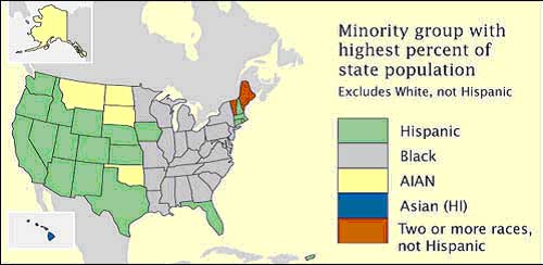
Nominal area choropleth map


Nominal area choropleth map is a choropleth map that is used to dispaly nominal data. Here is a map with nominal data showing which state's minority group has highest percentage of state population.

source: https://courseware.e-education.psu.edu/courses/geog482/graphics/citationexample.jpg

Unstandardized choropleth maps


Unstandardized choropleth maps utilize raw numbers when displayed. In the map displayed the data displayed is not averaged.

source: http://pubs.usgs.gov/fs/2005/3051/images/2000choropleth.gif

Standardized choropleth maps


Data in choropleth maps are standardized to allow comparison of distribution among different areas. Here is a map of Canada displaying the different area's population of people age 14 and under.

source: http://www.statcan.gc.ca/pub/92f0138m/2008003/figures/figure3.1-en.jpg

Univariate choropleth maps


A univariate choropleth map displays a single data set. Here only one set of data is displayed regarding poverty in the United States.

source: http://www.cdc.gov/pcd/issues/2007/oct/images/07_0091_02.gif

Bivariate choropleth maps


A bivariate map displays two variables on a single map by combining two different sets of graphic symbols or colors. Bivariate mapping is an important technique in cartography. Given a set of geographic features, a bivariate map displays two variables on a single map by combining two different sets of graphic symbols. It is a variation of simple choropleth map that portrays two separate phenomena simultaneously.

source: http://www.geog.le.ac.uk/russianheartland/DemographicMaps/images/PopulationMaps/RaionMaps/7RaionPopDenPerCh8902.jpg

Unclass Chorlopeth Map


This technique assigns shadings proportional to the data values so that these choropleth maps do not have to classify the data. This method of mapping has not been generally accepted because many cartographers claim that they lose the ability to direct the message of communication.

source: http://www.agocg.ac.uk/reports/visual/casestud/dykes/figure9.gif

Classed choropleth maps


source: http://personal.uncc.edu/lagaro/cwg/color/Choropleth-5Good.gif

Range graded proportional circle map


This proportional circle map uses ranges to depict the values of each circle. We can see from this map that most of the EID events in the U.S. take place in the northeast.

source: http://www.nature.com/nature/journal/v451/n7181/images/nature06536-f2.2.jpg

Continuously variable proportional circle map


A continuously variable proportional circle map is a proportional circle map which utilizes circles to create point data. This relates the scales to the specific data. The circles are in proportion to the variable being measured.

source: https://blogger.googleusercontent.com/img/b/R29vZ2xl/AVvXsEhlYScVjSoTZjHTAuEyrujrD_n4dr0Ls6X3bT50QQCJrk0JkszCxh2mk2yy9g03wOL6viHeTekA4gmJG5ACwETgdnX6eupaYxwtrkeQwJszzHJ5iLPJYVSlQwmDWIy5xUyDbKHRZImrjM8X/s1600-h/dotProporCircle.jpg

DOQQ


source: http://www.crwr.utexas.edu/gis/gishydro00/Class/trmproj/Donnelly/termproject_files/1_Red_DOQQ.jpe

DEM

A digital elevation model (DEM) is a digital representation of ground surface topography or terrain. It is also widely known as a digital terrain model (DTM). A DEM can be represented as a raster (a grid of squares) or as a triangular irregular network. DEMs are commonly built using remote sensing techniques, but they may also be built from land surveying. DEMs are used often in geographic information systems, and are the most common basis for digitally-produced relief maps.

source: http://en.wikipedia.org/wiki/Topographic_map

DLG


Digital Line Graphs (DLGs) are digital vector representations of cartographic information derived from USGS maps and related sources.

source: http://eros.usgs.gov/products/map/dlg.php

DRG


A digital raster graphic (DRG) is a digital image resulting from scanning a paper USGS topographic map for use on a computer. DRGs created by USGS are typically scanned at 250 dpi and saved as a TIFF. The raster image usually includes the original border information, referred to as the "map collar". The map file is UTM projected and georeferenced to the surface of the earth. DRG's are regularly used in GIS applications.

source: http://lter.kbs.msu.edu/maps/GIS/DRG_d.jpg

Isopleth


An isopleth map generalizes and simplifies data with a continuous distribution. It shows the data as a third dimension on a map, thus isopleth maps are more common for mapping surface elevations, amounts of precipitation, atmospheric pressure, and numerous other measurements that can be viewed statistically as a third dimension.

source: http://nadp.sws.uiuc.edu/isopleths/maps2003/cldep.gif

Isopach


An isopach map is a map illustrating variation of thickness within a tabular unit or stratum. Isopachs are contour lines of equal thickness over an area. Isopach maps are utilized in stratigraphy, sedimentology, structural geology, petroleum geology and volcanology.

source: http://www.searchanddiscovery.com/documents/2007/07022lash/images/ani04.gif

Isohyeths


The contours on this map are isohyets showing the month’s rainfall in 100mm bands.

Source:
http://www.scoop.co.nz/stories/AK0808/S00090.htm

Isotachs

Isotachs are found on a weather map and are used to show different wind speeds. This map is of Mexico and the western United States. When the Isotach lines are close together, that is where the wind is the strongest.

source: https://blogger.googleusercontent.com/img/b/R29vZ2xl/AVvXsEg_5n0X-wfHBcjLpLDEcIk8wAJABgOru2-9FaERjViIxSDIcwiMORhdn5-cPqHtF8rknSWGvtpA_BdLllNj8TORLZ6wZ72PWBsaBnf2IyvvFmYpBP7o8Dnqjs1Npsesd4HSN6xZAXNaPDI/s320/isotachs.gif

Isobars


A line drawn on a weather map connecting points of equal pressure is called an isobar. The isobars are generated from mean sea level pressure reports and the pressure values are given in millibars.

source: http://ww2010.atmos.uiuc.edu/(Gh)/guides/mtr/prs/isb.rxml

LIDAR


LIDAR (Light Detection and Ranging) is an optical remote sensing technology that measures properties of scattered light to find range and/or other information of a distant target. The prevalent method to determine distance to an object or surface is to use laser pulses.

source: http://www.math.ucdavis.edu/~widemann/research/Ground_Zero_Lidar.jpg

Doppler Radar


Doppler radar is radar that makes use of the doppler effect to produce data about objects at a distance. It does this by beaming a microwave signal towards a desired target and listening for its reflection, then analyzing how the original signal has been altered by the object(s) that reflected it.

source: http://www.weatherusa.net/blog/images/doppler-orlando-1943.gif

Black & White Aerial


Black and white aerial photograpy uses IR film to show a geographical visual of an area from the air. This map shows and area of Toronto from 20,000 feet.

source: http://www.math.toronto.edu/~drorbn/Gallery/KnottedObjects/Interchange/BWPositive.jpg

Infared Aerial Photo


Infrared aerial photography is a powerful tool. Not only can it be used to document changes to the environment, the health of forests, wetlands, bays and oceans, but it can also be used to document and monitor such items as damage to roofs, the tracking of dairy farm out flows, pinpointing the source of, and monitoring, insect or disease infested vineyards, or sites contaminated by toxic chemicals, and many more applications.

source: http://www.aerialarchives.com/imagedb/IR0010154f.jpg

Cartographic Animations


This is a cartographic animation of Hurrcane Katrina in 2004. This image moves and depicts the location and direction of the storm.

source: http://www.spc.noaa.gov/misc/carbin/katrina/kat5_1945.gif

Sunday, August 2, 2009

Statistical Map


Statistical maps provide statistical representation of an area. In this case the population distribution in the United States.

source: http://www.progetto-exp.org/filevari/immagini/mappe/map_pop_usa.jpg

Cartogram


A cartogram is a map in which some thematic mapping variable – such as travel time or GNP – is substituted for land area. The geometry or space of the map is distorted in order to convey the information of this alternate variable. There are two main types of cartograms: area and distance cartograms.

source: wikipedia.com, http://upload.wikimedia.org/wikipedia/commons/2/22/Cartogram-2008_Electoral_Vote.gif

Flow Map


Flow maps show how a product, people, or even a disease flows throughout a region or the world. It is somewhat of a directional guide as well because it can show the flow of something over a period of time.

source: http://www.mundi.net/maps/maps_014/august2000_small.gif

Isoline Map


Isoline maps are a two dimensional representation of a three dimensional model. An isoline map give you a picture of the concentration of people. In this case it is used to measure and depict annual precipitation for Mexico.

source: http://www.lib.utexas.edu/maps/atlas_mexico/mean_annual_precipitaion.jpg

Proportional Circle Map


This is a Proportional Circle Map representing population for the selected group in Canada. These maps are a good for graphical representation of population in an area.

source: https://blogger.googleusercontent.com/img/b/R29vZ2xl/AVvXsEhIhWMzao_ock35wuNdWPM0OTMcFA0tGlwSVhoGUUUdSQRZuoJEOleZbN_smRK4YhRvwV7UIiDh7UFg0XKj0glhSekoxx08CB18so5d3EXTBEikgYAPlVmDOtV8RRFslBzYPo17xlUIxqE/s1600-h/prop+circle1.gif

Sunday, July 26, 2009

Choropleth Map


Choropleth are thematic maps based on predefined aerial units. Think of it as a multi-colored checkerboard map. Some maps, (ex. road maps), show many types of data while thematic maps are made to show only one specific set of data. Because each group of data is organized as a ratio value, (a zero value for comparison is present), we use what a graded color series to show least intensity to most intense (shown using a light to dark color pattern).

source: http://my.ilstu.edu/~jrcarter/Geo204/Choro/Tom/hispanic_race_fl-H1_FINAL.gif

Dot Distribution Map


This is a dot distribution map of Ohio. Represented are the number of military families in the state.

source: http://operationmilitarykids.ohio4h.org/resources/images/dotMap.gif

Propaganda Map


A very “colorful” propaganda map which shows how America and USSR union face by each other at the Cold War.

source: http://strangemaps.files.wordpress.com/2006/11/800px-reagan-digitised-poster.JPG?w=474&h=362

Hypsometric Map


Hypsometric maps represent the elevation of the terrain with colors. The area between two neighboring contour lines receives one specific tint.

Hypsometric colors are most common in topographic maps at small scales, either applied as continuous gradients or intervals. The succession of colors occurs according to different rules.

source: http://www.reliefshading.com/colors/pictures/hypso_france.jpg

PLSS Map


This PLSS Map is of Alabama. The grid lines are used to survey land for recording ownership. The township in blue is Franklin County.

source: http://www.rootsweb.ancestry.com/~alfrankl/plss_basemap_alabama.jpg

Cadastral Map


A cadastral map is one that shows land plots and ownership of those plots. This particular one is showing the ownership in the state of Delaware.

source: http://mapsgis3015.blogspot.com/2008_12_01_archive.html

Planimetric Map


Planimetric maps are digital, graphic maps that portray the horizontal position of planimetric features using lines and symbols. Ground control is set for this product. Aerotriangulation is performed to determine the position and orientation of the camera for each exposure so planimetric features are shown in their true relative coordinate position.

source: http://www.ncdot.org/doh/PRECONSTRUCT/highway/photo/Products/Planimetric_maps_default.html